design
Archived Posts from this Category
Archived Posts from this Category
Posted by ben on 20 Aug 2009 | Tagged as: design, politics
Lucky Jim, a London squatter with a great blog, scores some old anti-colonialist posters at one of his squats. I’m particularly fond of the ANC posters:

African National Congress poster
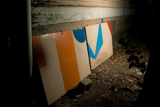
Posted by ben on 06 Aug 2009 | Tagged as: art + bikes, design, sneak peeks
Daniel Saldaña dropped by the other day to show off his new penny farthing art bike. This piece will be in his “Electroism” show opening tonight at Blue Star. For more background, see Saldaña’s bikes here and here, and the Current article by Elaine Wolff. Also, check out his work in the ongoing David Shelton exhibit, Multiples.

Daniel Saldaña standing with his newest art bike

Daniel Saldaña art bike handle

Daniel Saldaña art bike ornament
Posted by ben on 21 Jul 2009 | Tagged as: architecture, ceramics, design, public art
Platform 21 is hyping repair as “the new recycling” with its Repair Manifesto, along with various contests and publicity efforts. It’s interesting that some of the “repairs” Platform 21 is publicizing are not functional or structural, but are really aesthetic in nature.

This Jan Vormann project is cool, but it doesn’t appear to offer much in the way of structural integrity. Then again, maybe that’s not the point — highlighting quirky projects like this means more attention for the project, and perhaps a broader reach for the “repair ideology” it is pushing. It also encourages people to think creatively about repair, and makes a chic movement out what often becomes just a greasy time sink. So here’s my contribution: a handmade porcelain teacup I broke and repaired a little while back. It’s not as flashy as Legos in a brick wall, or the “golden seams” of traditional Japanese tea bowl repair, but out of four similar cups, this is now my favorite.

PS. This cup inspired another Emvergeoning post a while back.
Posted by ben on 24 Jun 2009 | Tagged as: arts organizations, books, conceptual art, coverage, design, photography, responses/reviews
Dan Goddard, the Express-News’ long-time art critic who was recently canned in a round of layoffs, has just published two good articles dealing with Linda Pace properties. In the San Antonio Current, he discusses the fate of Pace’s storied art collection, and it’s forthcoming permanent home. Designed by British architect David Adjaye specifically for the Pace collection, the project is on hold due to the economic downturn. Apart from that news, which I’ve been hearing unofficially for a while, Goddard reveals many interesting tidbits about the collection, Linda’s personal relationships with various artists, and the ongoing activities of the foundation. I was excited to learn that the Linda Pace Foundation is funding a public work by Jesse Amado to be installed at the downtown library (it will surely be a welcome contrast to their Chihuly).
On Glasstire, Goddard reviews Jonathan Monk’s “Rew-Shay Hood Project Part II” at Artpace. There’s some good context here for understanding the subtleties of the show, from Monk’s history with appropriation to Rucsha’s Catholic background, right down to curator Matthew Drutt’s obsession with vehicle-related art. That Goddard brings up Dave Hickey’s discussion of Ruscha is interesting, given Hickey’s interest in custom cars as an artistic medium. Some people I’ve talked to about the show come away with the impression that Monk is having the Ruscha photos painted on car hoods from the same period; Goddard points out this isn’t the case, the hoods come from one or two decades later than the photos. Perhaps what’s going on here is a contrast between the beginning of the idea of an “artist’s book” (the move away from the artist creating singular, unique objects) and the end of the era of the custom muscle car. As Goddard points out, the push for more efficient, less polluting cars using computer technologies pushed out custom car hobbyist culture to a large extent. But the rise of these computer technologies also empowered artists to move into their own mass production, at the same time allowing the kind of appropriation that Monk himself uses. Although Ruscha wasn’t using computers to produce Twentysix Gas Stations (and I don’t know if Monk used them in his reproductions), they are the descendents of the mass-production technologies that printed Twentysix Gas Stations, and Monk’s relevance certainly has a lot to do with them. Thus in the show we have the suggestion of a kind of ebb and flow, technology and the markets at certain points inspiring very personal expression, at other points depersonalizing art even to the point that it becomes design. And isn’t Monk here acting more like a designer than an artist, if by design we mean depersonalized visual communication?
Posted by aaron on 15 Jun 2009 | Tagged as: coverage, design, music, rock!, typography

An apparently forged Sex Pistols flyer fools Christie’s authenticators and ignites controversy amongst internet rock’n'roll/design geeks.
As part of an ongoing project archiving San Antonio music flyers on my Facebook page, I have been frequenting the website Gigposters.com to comb through its San Antonio-related contributions. Early last week, I came across a singular new addition – the flyer pictured above, purporting to be from the Sex Pistols notorious Randy’s Rodeo concert in San Antonio on January 8, 1978. (Headline from the next day’s Express-News: “Pistols Win S.A. Shootout.”) The third date on the Sex Pistols short-lived American tour, it has gone down in punk rock lore as the concert at which Sid Vicious, after being repeatedly hit in the face with airborne full cans of beer, retaliated against the offending audience member’s head (and possibly innocent bystanders as well) using his bass guitar.
Posted by ben on 13 Jun 2009 | Tagged as: adventure day, art + bikes, art paparazzi, design
As I was walking my bike down the road to get a flat fixed, Daniel Saldaña stopped to offer me a ride to the shop in his pickup. I was doubly lucky: Saldaña had his new art tricycle in the truck and let me snap a few shots before delivering it. (See this post for more on Saldaña’s art bikes).


Posted by ben on 24 Mar 2009 | Tagged as: architecture, design, intellectual property, public art
UPDATE: I just talked to Bill FitzGibbons about an error and some clarifications that need to be made in this post. First off, FitzGibbons is being sued by the City of McAllen. FitzGibbons’ lawyers had drafted a letter to the city to discuss the apparent infringement of his rights, and the city responded by suing in federal court, requesting a ruling affirming their legal right to install this piece.
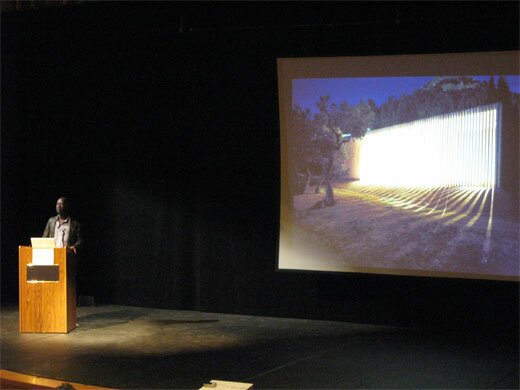
Apart from that glaring error, FitzGibbons pointed out compositional and conceptual similarities between the pieces. I have only seen two photos of the underpass in McAllen, so I’m just passing on FitzGibbons’ description. Compositionally, the McAllen piece is apparently very similar to Light Channels, in terms of the colors it uses and their sequencing. (In the Current article, McAllen officials are quoted as saying it is different because they did not employ the “chasing” effect that can be seen in Light Channels). Conceptually, Light Channels was designed to connect downtown San Antonio to the near east side, which is cut off by a highway. Highways create psychological barriers, the underpasses mostly being associated with vagrants, but Light Channels turns this into a safe, welcoming passageway. Similarly, , dividing downtown from the mall, the country club, the airport, and, just a little further south, from the border with Mexico. The underpass lighting in McAllen is at the intersection of 83 and S 10th St, a major street that leads the attractions listed above. FitzGibbons’ argument, then, is that conceptually as well as formally, this work mimicks Light Channels. Architectural lighting has been used on underpasses in a number cities; it is the form and purpose of the lighting that this case is dealing with, not the use of lights.
The original post is below:
The Current did some research into Bill FitzGibbons’ lawsuit against the city of McAllen, Texas for apparently ripping off his “Light Channels” piece in downtown San Antonio. From what I can tell, it’s pretty clear that McAllen’s new installation is at the very least extremely derivative of FitzGibbon’s work, and the city officials really ought to be ashamed for so blatantly ripping him off.
But at the same time, I’m not so sure about how successful this lawsuit will be. The lighting system FitzGibbons uses was developed by Philips, and is used for architectural lighting all over the world. If FitzGibbons can sue McAllen for sticking the lights in a highway underpass, whats to stop Fisher Marantz Stone (designers of the lighting on Brooklyn Borough Hall) from suing FitzGibbons himself for a similar use of Color Kinetics on the Alamo? This highlights the differences between designers’ and artists’ attitudes towards intellectual property. While a designer may regard a cheap imitation of her work with contempt, she’s generally not going to sue the offending party unless it’s an exact replica. Artists, I think, tend to feel a stronger sense of ownership over their work and even their concepts.
This may prove to be an interesting legal battle, as it seems it will be fought in something of a legal gray area. Of course, I’m not a copyright lawyer, and the case could be a lot more clear cut than I assume.
Posted by ben on 24 Mar 2009 | Tagged as: design, essays, typography
Emigre expands one of my favorite font families with some new faces that are better suited to longer texts:
One area where Mrs Eaves seems less comfortable is in the setting of long texts, particularly in environments such as the interiors of books, magazines, and newspapers. It seems to handle long texts well only if there is ample space. A good example is the book / CD / DVD release The Band: A Musical History published by Capitol Records. Here, Mrs Eaves was given appropriate set width and generous line spacing. In such cases its wide proportions provide a luxurious feel which invites reading. Economy of space was not one of the goals behind the original Mrs Eaves design. With the introduction of Mrs Eaves XL, Licko addresses this issue.
Read the whole thing for an interesting discussion of the development and refinement of this Baskerville revival. Baskerville himself is an interesting character, a master typographer / printer / binder / paper maker whose greatest work was the Baskerville Bible, despite the fact that he was an atheist who saw himself as advancing the cause of rationalism through his type designs.
Posted by thomas-cummins on 23 Jan 2009 | Tagged as: design, typography
Ben’s link about Google’s philosophy towards a perpetually evolving brand is certainly a new corporate policy but logo evolution has always been around. San Antonio’s own AT&T morphed from an imposing Death Star logo to a more eco-friendly looking globe which the viewer can look down upon. Notice AT&T’s font also changed from the commanding CAPITALIZED letters to a more genial type.
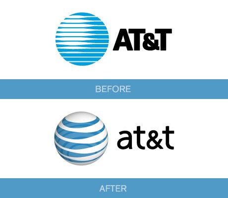
at&t
My favorite is Starbucks’ logo though. The Seattle-based company started off with a traditional image of a mermaid but failed to realize she was nude and opening her legs for wandering sailors. I guess when you’re stuck on a boat with a bunch of men for months on end you begin to see women everywhere. As Starbucks grew into a blue chip Corporation they updated their obscene image by covering her breasts with her hair, cropping her legs off, and abstracting the entire image. Throughout the ages, the siren myth has always been a means for artists to portray how bodily impulses often lead us to disastrous results despite our better judgment. How fitting, then, that Starbucks similarly lures its customers in and convinces them to buy a $5 coffee despite their better judgment. How else does Starbucks make so much money just selling a drink? Because coffee is a legal drug.

Starbuck's Siren
Posted by thomas-cummins on 20 Jan 2009 | Tagged as: design, video/film

Stare at the black cross for 30 seconds.
The above image is an optical illusion sometimes referred to as the Lilac Chaser. It’s the result of several different known visual phenomena including:
Negative Afterimage – The everyday experience we have when we see something very bright and then continue to see its floating silhouette even after we look away from it. The neutral gray background seen here works to enhance this effect and this interactive site allows you to change the dot’s color to see opposing ghost colors.
Troxler’s Fading – First discovered in 1804 by Ignaz Troxler. Basically, we have a blind spot in the middle of our vision (called Scotoma) but we constantly make up for it by having two eyes, rapid eye movement, and also a brain that fills-in the missing information. Unvarying stimuli, however, is able to escape our focus. Similarly, we may feel our clothes when we first put them on but we soon forget about them even though they are still probably touching millions of neurons on our skin right now. A similar illusion is seen below and you can also test your blind spot at this website.

Filling-in
Posted by ben on 13 Jan 2009 | Tagged as: arts organizations, comics, design, video/film
Paul Richards’ article in the Washington Post advocating for a Disney-based museum show has inspired some interesting responses around the blogosphere. Greg Allen makes a plausible case that it’s nothing more than “a fanboi/critic [trying] to turn some offhand party chatter about the worst show ever into a mouse-eared museum manifesto.” Kriston Capps, in a more even-keeled post gets a bit closer to what I see as the real problem with the idea:
To admit Disney would be to open up a massive new genealogy in visual art that includes all the things that are visual but aren’t called art. So it wouldn’t be Disney and Murakami or Disney and younger fine artists but Disney and the makers of Final Fantasy or Disney and the Coca Cola designers. That might all be defensible, but it would get very confusing very quickly.
Just because something is important does not make it visual art and at the end of the day, just because something is visual art does not mean that it is represents the most important visual thing. Rather this notion of visual art you find at museums offers a streamlined conversation within visual culture, one that (one hopes) influences and is influenced by other conversations in the broader culture. But museums cannot hope to archive all those other conversations, too.
But I think it’s not just a question of what is deemed visual art or what is deemed important. The issue comes down to a more practical question of access. Museums allow us to see genuine, rare works of art from a field that was founded on prizing the unique object. When you start to show Mickey Mouse cartoons, interesting and important as they may be to visual culture, you’re showing people things they can already see in the comfort of their homes. It’s not that the material is inappropriate for the museum, but that museum treatment isn’t necessary. Without the museum, many of us would never get to see a Frank Stella except as a reproduction; but if all the museums in the world disappeared, we could still participate in the visual culture of cinema, more or less in the way it was intended to be viewed.
Maybe we’re past the point where we refuse to consider Disney or Alfred Hitchcock or Matt Groening to be “real artists,” but that doesn’t mean that the public would be well-served by seeing their work in museums.
Posted by ben on 12 Jan 2009 | Tagged as: design, music

Death Messiah logo by Christophe Szpajdel
I was tipped off (by Design Observer) to an interview in Vice magazine with Christophe Szpajdel, who Vice calls “The Dark Lord of Logos” (but who Design Observer has dubbed “The Paul Rand of Metal”) — the designer responsible for the logos of over 7,000 metal bands.
Posted by ben on 06 Jan 2009 | Tagged as: design, essays
Michael Cannell has an interesting article in today’s NYT about economic depression bringing about a resurgence in good design and architecture:
In the lean years ahead, “there will be less design, but much better design,” Ms. Antonelli predicted.
There is a reason she and others are optimistic: however dark the economic picture, it will most likely cause designers to shift their attention from consumer products to the more pressing needs of infrastructure, housing, city planning, transit and energy. Designers are good at coming up with new ways of looking at complex problems, and if President-elect Barack Obama delivers anything like a W.P.A, we could be “standing on the brink of one of the most productive periods of design ever,” said Reed Kroloff, director of Cranbrook Academy of Art.
Michael Beirut shows us what this will look like from the designer’s perspective in a post at Design Observer:
The modern design studio can’t help but subscribe to the cult of asap. But while working at full speed is great for profit margins, it’s not so good for quality control. A design solution almost always benefits from a second, third or fourth look. Take advantage of the slower pace of a recession by remembering what it was like in design school to spend a full semester on a single project. What seemed then like torture may now feel like a luxury, and your work will benefit. And don’t forget that recessions are a great time for the kind of research and development that manifests itself in self-initiated projects, work that takes a longer view than the next deadline.
UPDATE: Design Observer posts Murray Moss’ take on the issue. Being a dealer in the high-end design that Cannell decries, Moss seems pretty pissed off (and defensive) about the NYT article. A quick read of the comments by DO readers gives a good idea of the polarization this idea is generating.
Posted by ben on 27 Nov 2008 | Tagged as: acquisitions, art paparazzi, design, public art, sneak peeks
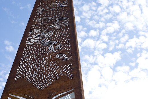
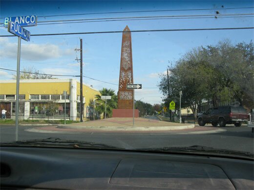
San Antonio’s newest public artwork was installed yesterday at the intersection of Blanco and Fulton, in the center of a new roundabout. The internal lighting system is not installed, however, and the piece will not be completed until a December 15 lighting ceremony. A press release sent out by Public Art San Antonio explains the significance of the piece:
The design of this new public art work at the roundabout draws a physical and spiritual link between “Beacon Hill”, the name of the neighborhood in which it is located, and its two most predominant architectural styles: Art Deco and Arts and Crafts. These are symbolically represented by the artwork’s two main components: a “sunburst” motif on the brick pavement of the roundabout and its obelisk-shaped “beacon/luminaria.” The “sunburst”, the most popular of all Art Deco motifs, metaphorically stands for its life giving force and the revitalization of the inner city business corridor. The “obelisk”, a symbolic quadrangular vertical sunray made out of steel, will serve as a sundial during the day. Its perforated allover design begins at the bottom with symbols of indigenous ancestral life cycles followed by references to the landscape that the traveler encounters on route to the town of Blanco, Texas.
Emvergeoning made it out to snap a few photos, followed by (highly recommended) pumpkin empanadas from the D.J. Bakery down the street.

Posted by ben on 15 Sep 2008 | Tagged as: architecture, design, graffiti, public art, responses/reviews
Near the end of the Q&A following the Art Guys‘ lecture at UTSA last week, one woman challenged the Houston collaborative’s assertion that their art doesn’t have to mean anything. For this audience member, meaning arises between the object and the viewer, regardless of the intentions of the artist. She must have touched a bit of a nerve; for the first time all night, the Art Guys set aside their jokey, unpretentious demeanor and turned ever-so-slightly preachy. Although the exchange was grating to my ears, it revealed quite clearly an underlying agenda of this 25-years-in-the-making art duo: to short-circuit meaning and expectations in human interaction. At one point, Art Guy Michael Galbreth pointed to a chair and rhetorically asked: What does this mean?
The following night, UTSA (in collaboration with Artpace) hosted a lecture by David Adjaye in which he focussed on his work with public spaces. Early in the lecture he raised the idea of “editing the city.” Throughout the talk this phrase came back to me again and again, as I saw Adjaye weave together cultural artifacts, contemporary urbanist theory, and old-fashioned human proportions into buildings that are at once blank and full of personality. What became clear is that a building can be a segue in an urban environment between two types of space (or even two senses of time), it can tell you something about the city, or about how you should interact. In one case, Adjaye insisted on building a café on the top of a larger London building he was designing, while his clients and others wanted it on the street level. During the lecture he pointed out that having this café above the street would allow people who spend all day on the streets to have a view of the city from above — to see the skyline and the rooftops. But beyond the aesthetics, this placement says something about leisure time, and the way that people ought to share it. Above the street. Away from the hustle.
And so this building says something about the way that people ought to interact, about what they should value. In this same sense, a chair says something about how and where we ought to sit. In the auditorum where the Art Guys spoke, all of our chairs were lined up in a particular way that focussed our attention. If we had walked into a room with 500 pillows on the floor, the space would indeed have had a different meaning. So yeah, Mike, the chair means something.

But I don’t intend to play a game of gotcha here. John Cage was perfectly right to say that ““, and the Art Guys do a fine job of short-circuiting meaning in a way that reveals and deepens acts of observing and understanding. An example: During a residency in San Francisco, the Art Guys noticed a dumpster across the street from their apartment. They watched as the community used this resource as a place to discard, and a place to acquire. Something to crouch behind while shooting up heroin, something to throw up in. A canvas for the taggers. It was constantly overflowing with trash, pushed from one end of the parking lot to the other, covered with grafitti. One evening the Art Guys painted the dumpster gold. Shortly thereafter, the property owner cleaned up the area, and started keeping the dumpster under lock and key. The question of why all this happened — why the dumpster was painted gold, why it was treated differently after being painted — is a kind of absurdity that reveals a lot about human interaction. In a sense, it doesn’t mean anything. But it is a catalyst for observation and thought.
Where David Adjaye revealed something about a city by imbuing a building with a different kind of meaning, the Art Guys revealed something about a city through an act of absurdity. In architecture, so often forgotten among its inhabitants, Adjaye pushes us to awareness with an overriding sense of intentionality and purpose; in art, so often overanalyzed by its devotees, the Art Guys push us to awareness with unrelenting whimsy.
Note: The Art Guys have an exhibit called Cloud Cuckoo Land up at UTSA’s 1604 campus through October 12. David Adjaye’s exhibit, Making Public Buildings, is up at Artpace through January 4.
Posted by ben on 27 Jul 2008 | Tagged as: art paparazzi, design, party photos, performance art, public art, silliness, video/film
Emvergeoning’s exclusive footage from the 2008 Pushcart Derby:
Posted by ben on 24 Jul 2008 | Tagged as: design, interviews, performance art, public art, renegade performances, silliness
Matt Fleeger from KRTU 91.7 (where I am a volunteer DJ) just sent us his interview with Cruz Ortiz about the Contemporary Art Month Pushcart Derby. The interview aired this airs tomorrow morning, and the Derby is this Saturday at Dignowity Park (see our event listing). We’ll be posting photos and video of the derby for those of you out there who crave mediation. Click on the little play button below to listen.
Posted by ben on 10 Jul 2008 | Tagged as: adventure day, design, graffiti, net.art, photography
An old friend sets out to chronicle New York City through its ATMs on a new blog, aptly titled :
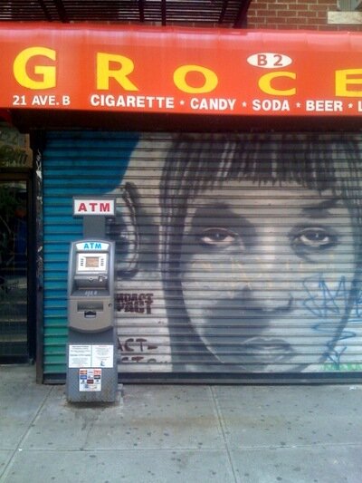
UPDATE: ATMNYC’s author writes:
The photos on atmnyc are taken with my iphone and then emailed directly to the tumblr blog. So the pictures are all snapped and posted in almost the same instant. I like to think of it as a sort of updated polaroid style. The limits of the iphone camera, the problems with focus, the tendency to blur and glare, even the dimensions of the photo, actually remind me a lot of the old Polaroid Land Camera.
I do not photograph any indoor atms unless they are visible from the street. I take many of the pictures quickly from my bike. I make little effort at composition— the city takes care of that part itself.
I used to hate the sight of atms, thinking that they were a regrettable intermediary techno clutter, not unlike the cell phone towers tacked onto so many historic Manhattan apartment buildings. On the other hand I find payphones charming, perhaps because they are nearing their obsolescence. Likewise, New York’s rooftop water towers are beautiful appendages, so maybe cellphone towers should be indulged as well.
In any case, I’ve become fond of atms, and have come to see them as helpful little droids, standing on corners blinking their senseless cyclopes eye, waiting patiently to serve the needs of a passing master– for a small fee, of course. In the meantime they are heaped with every abuse offered by graffiti, violence and the weather.
But despite my growing sentimentality for the things, I still get my cash from the teller at a local branch bank.
Posted by ben on 09 Jul 2008 | Tagged as: design, typography
Here’s an interesting post putting handwriting samples of typographers up against their type designs:
Lately, I’ve been asking just one question, though. Something which has always intrigued me: these people that help us communicate … how do they themselves communicate? If we strip away the monitors, and the printing presses, and the typefaces … how would William Caslon have written on a post-it note?
Would have been interesting to see historical examples, such as John Baskerville and Nicolas Jenson, but it’s pretty cool nonetheless.
[hat tip]
Posted by ben on 01 Jul 2008 | Tagged as: acquisitions, adventure day, arts organizations, design, photography, politics, public art
It was closing time at my neighborhood bar, the three of us leaning on a concrete table surrounded by cactus, when I heard about the dumpster full of art. A large scale public mural by Anton Vidokle was in the process of being removed by a company which had bought the building. The mural, an application of 100 vinyl decals on metal panels, depicted simplified versions of logos from bankrupt companies. Now the panels were being removed and thrown in a dumpster in the parking lot next to the building.
Installation shot of 100 Bankrupt Corporations (public geometry) by Anton Vidokle (courtesy Artpace)
We finished our beers, jumped in the car, and headed downtown. When we found the dumpster at around one in the morning, we realized immediately that we weren’t the first San Antonio art scenesters to have this idea. While almost all of the panels had been removed from the building, only a dozen or so were left in the dumpster. We jumped in and started throwing our favorites out into the parking lot. After cramming as many as we could into the trunk of the car, we took off, leaving a few for any other art scavengers who might not look down their noses on dumpster diving. After installing a panel with red semi-circular fragments of anonymous logos in my living room, I started noticing the other pieces around San Antonio. Stacked up near studios, hanging on workshop walls, leaning up against houses, they spoke of something just out of reach. Over the course of their lives, from symbols of production and commerce which drowned in a sea of such symbols, to their resurrection as material for an intricate yet minimal public mural, and finally to their cold, arbitrary fragmentation along the lines of a surface grid, they moved from abstraction to abstraction, carrying bits of identity from place to place.
Photos of Vidokle panels in the wild by Justin Parr
 For a long time I waited for the few remaining panels along the top and down one side of the building to be removed. Every time I drove down San Pedro I looked to see if a few more of these public geometries had been taken from the face of the building, if perhaps the dumpster might have a few more treasures in it. And for a long time nothing happened. The building remained unchanged. After some months I forgot about the few logos that remained in their public home, and the mostly-deconstructed facade slowly slipped into the background of my focus.
Then one day it was gone. Not the facade, the panels that were always too exentric to remain for long, but the building itself, which had been reduced to a heap of rubble. A slight controversey ensued, but that too will slip from the front of our minds before long. Still, these little pieces of the mural endure, reminders of the simplified, fragmented memories we collect from our meanderings through the city; reminders of the sometimes crude identities we carry with us, and the ways they can be resurrected, transformed, annihilated.
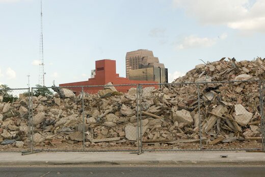
Photo of Jorrie Furniture Building rubble by Justin Parr
Posted by justin on 05 Jun 2008 | Tagged as: acquisitions, adventure day, art + bikes, art paparazzi, design, in yo face, rumors, silliness
public art? aqualung? pigeon coop? design by committee? I’m trying to get a good angle on it, but nobody seems to know ANYTHING about these. Pictured below, I’ve spent the last 2 months asking people “in the know,” if they know of, or have seen these objects, to no avail. Do you know anything about these giant acrylic hollow boxes, sheathed in metal and bathroom tile on the fore-front of our walk through downtown to the Alamodome? I’m not sure of the exact install date, but I have seen them unchanged in their current condition since the 2 weeks preceding the Final Four basketball games that gripped downtown San Antonio for a week. Possibly its unfinished? ..or maybe I just don’t get it.
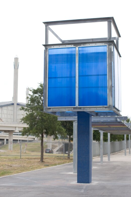
(more images by clicking below)
Continue Reading »
Posted by ben on 31 May 2008 | Tagged as: acquisitions, announcements, arts organizations, design, rumors, sneak peeks
A few days ago Dan Goddard posted some interesting details on the museum that will house the contemporary art collection of Linda Pace:
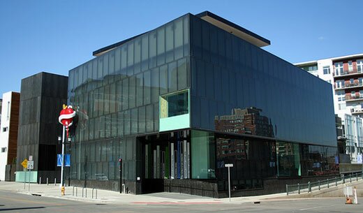
By this fall, the foundation expects to select a site in San Antonio for the construction of a permanent home for Pace’s contemporary art collection, including works by Willem de Kooning, Olafur Eliasson, Isaac Julien, Richard Tuttle and Rachel Whiteread. British architect David Adjaye, who designed the Museum of Contemporary Art in Denver, is working on the project.
Some are anticipating that the museum, when completed, will be as important as the Menil in Houston (we’ll see…). Adjaye has already created a model for the museum which was sort of viewable through the glass of a locked office door in the Linda Pace Foundation offices during an event last night. I just caught a quick glimpse, but the model seemed less boxy than some of Adjaye’s more well-known projects, such as the Museum of Contemporary Art in Denver (above).
An exhibit of Adjaye’s work will be traveling to the Hudson (Show)Room at Artpace in September. The show, organized by London’s Whitechapel Art Gallery, is called “Making Public Buildings” (a catalog is ). As usual with Hudson shows, Adjaye will be giving a walk-through at the opening on September 11. In addition to high-end London homes and public buildings such as museums and libraries, Adjaye has collaborated with artists Olafur Eliasson (see here) and Chris Ofili (see here) on projects that blur the line between visual art and architecture. Adjaye’s buildings are noted for their experiential sensitivity and their ability to respond to the surrounding environment.
We’ll give you more details as we get them…
Posted by ben on 23 May 2008 | Tagged as: design
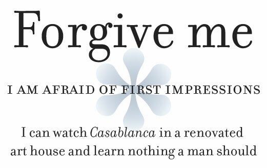
Forgive me for posting what amounts to an advertisement for Emigre’s Bodoni revival typeface, Filosofia. The following is a love letter to Filosofia taken from an Emigre catalog, and I just enjoy reading it too much to resist posting. The image above is set in Filosofia.
Dear Filosofia,
Forgive me. I am afraid of first impressions. I can watch Casablanca in a renovated art house and learn nothing a man should learn. I have seen you escape from your lectures to sip a cappuccino with your back to the café door. You don’t want your business students to notice you leafing through a catalog, and, if they do, you want a quick way out. I understand. You are guardedly ambitious, elegant skirts always past the knee, eyeglasses firmly set on the bridge of your nose: a modern independent woman who demands creative devotion from the apes who grunt for your attention. I have failed to approach you. There is history in you, and I don’t trust myself to respect the silence. I might want too many answers. I blame nerves, bad timing, my life’s tedious projects which are like puppies snapping at my laces. Too many base distractions when I want only to see you. I wish with all my heart to avoid ever being accused of staring too long. So now I am relying on this old-fashioned technology, the letter. To write a letter is now an art, a curiosity, and exuberance, like dusting off an ancient typewriter to prove that the depth of one’s feelings is as vast as time itself. This letter is my awkward gesture. I am at the door, an ape signing a mute language, hoping you will somehow hear, and turn around.
Posted by ben on 21 May 2008 | Tagged as: design, politics
A few days ago Andrew Sullivan reposted an analysis of presidential candidates’ font choices written by and based on a segment that aired on ABC. As discussed in these pieces, Obama uses Gotham, which is a very new font based on an old sign at the New York Port Authority Bus Terminal. Hillary uses Baskerville, designed in 18th century England and popularized in America by Benjamin Franklin. McCain uses Optima, which was created by prolific German type designer Hermann Zapf in the 1950s. But there’s a bit more to this.

First off, as Design Info notes, the typefaces Obama generally uses for his word marks are not Gotham. One word mark uses Perpetua, released in 1929 by Monotype; the other uses, as far as I can tell, a bold version of Requiem, designed by Hoefler & Frere-Jones, the creators of Gotham. (Although Hoefler & Frere-Jones don’t offer a bold version of Requiem, so maybe that’s not it.) Gotham was originally designed for a commission for GQ, which wanted a strong masculine font that felt traditional yet contemporary. Requiem is based on a face found in a Renaissance writing manual, and, according to the creators, “celebrates the fertile world of Renaissance humanism.” Perpetua was designed by Eric Gill, a stone cutter who saw Perpetua as a rational, humanist type for the 20th century. This is a complex mixture of type decisions, but I think it all boils down to a set of progressive, rationalist types that convey strength.

Hillary’s choice, Baskerville, is also a rational, neoclassical face created by British printer John Baskerville, a vocal atheist. Oddly enough, his magnum opus was the “Baskerville Bible,” printed for Cambridge press. Baskerville created only a small edition of this Bible, for which he created the ink and paper, as well as using his own typeface. Hillary’s choice in using this font is, I think twofold. First of all, it has historical roots in revolutionary America, where it was championed by Benjamin Franklin, a friend of Baskerville’s. Second, its use today is somewhat academic (its use was revived by Harvard University Press in 1917), and lends Hillary’s campaign the wonky character that she worked so hard to develop before ditching it for gritty populism sometime between the primaries in Ohio and Pennsylvania.

John McCain’s choice, Optima, was designed by Hermann Zapf, a German designer who modeled it after Roman inscriptions. I actually think the McCain campaign’s choice here was fairly straightforward: Optima is used for the engravings on the Vietnam Memorial. Since McCain’s campaign is largely based around his military experience, this choice makes sense.
Extra Bonus Link: the designers of Obama’s font choices Gotham and Requiem make fun of McCain’s and Clinton’s font choices.
Posted by ben on 05 May 2008 | Tagged as: books, design
In connection to Hirsch’s essay on walking and poetry I discussed recently, here’s a snippet from Robert Bringhurst’s The Elements of Typographic Style:
For all the beauty of pure geometry, a perfectly square block of type on a perfectly square page with even margins all around is a form unlikely to encourage reading. Reading, like walking, involves navigation – and the square block of type on a square block of paper is short of basic landmarks and clues. To give the reader a sense of direction, and the page a sense of liveliness and poise, it is necessary to break this inexorable sameness and find a new balance of another kind. Some space must be narrow so that other space may be wide, and some space emptied so that other space may be filled.
The connection between architecture and typography surfaces at a few points in this book, which is a connection worth exploring a bit. I wonder if that is a more apt comparison than Marshall McLuhan’s assertion that “the book is an extension of the eye… clothing, an extension of the skin.” That is, is the typographic environment (and more broadly the media environment) more an extension of the body, or a kind of social space that accommodates the body? More likely, it’s a bit of both; but I think the distinction is worth considering.