design
Archived Posts from this Category
Archived Posts from this Category
Posted by ben on 24 Apr 2008 | Tagged as: design, music
Since I presumed to compare Brian Eno’s Music for Airports to Satie’s formulation of ‘furniture music’ in this post, I thought I’d let Mr. Eno have his say:
Whereas the extant canned music companies proceed from the basis of regularizing environments by blanketing their acoustic and atmospheric idiosyncrasies, Ambient Music is intended to enhance these. Whereas conventional background music is produced by stripping away all sense of doubt and uncertainty (and thus all genuine interest) from the music, Ambient Music retains these qualities. And whereas their intention is to ‘brighten’ the environment by adding stimulus to it (thus supposedly alleviating the tedium of routine tasks and leveling out the natural ups and downs of the body rhythms) Ambient Music is intended to induce calm and a space to think.
— Brian Eno, in the liner notes to Music for Airports
Posted by ben on 24 Apr 2008 | Tagged as: design, silliness
Daniel Finkelstein discusses the intricacies of logo design.
Posted by ben on 16 Apr 2008 | Tagged as: acquisitions, design, poetry
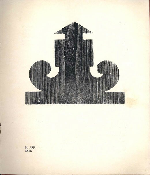
UbuWeb recently posted issues 1-3 of Tristan Tzara’s Dada magazine, which ran from 1917 to 1919. Unfortunately, they didn’t post the final, combined issue 4-5, which features some important works by Picabia, as well as Arp, Breton, Cocteau, and Radiguet. Still, a great little contribution to UbuWeb’s amazing archive.
Posted by ben on 15 Apr 2008 | Tagged as: design, music
“Nevertheless, we must bring about a music which is like furniture — a music, that is, which will be part of the noises of the environment, will take them into consideration. I think of it as melodious, softening the noises of the knives and forks, not dominating them, not imposing itself. It would fill up those heavy silences that sometimes fall between friends dining together. It would spare them the trouble of paying attention to their own banal remarks. And at the same time it would neutralize the street noises which so indiscreetly enter into the play of conversation. To make such music would be to respond to a need.” — Erik Satie, prophesying Muzak.
Isn’t it interesting that architects have not taken up music as a part of their discipline? We have all this music now which is piped in but bears no particular relationship to the space which it inhabits. I suppose the only architectural sound works I’ve experienced are the pieces Max Neuhaus created for Dia:Beacon and Times Square. He’s on the verge of installing another permanent sound installation at the Menil in Houston on May 3, which will be only the third permanent sound work of his in the United States.
Neuhaus doesn’t conceive these works in the way that Erik Satie talked about ‘furniture music’ — he speaks instead of using the sound to “transform the space into a place” — and I think this notion is more socially sensitive than Satie’s conception. Satie’s idea is probably closer to Brian Eno’s Music for Airports, which, although it was created for a specific airport, was never “installed” in that space, and now exists as just another ambient recording.
Update: Just to clarify, what I’m talking about here is not the quality of Satie’s compositions, but his conception of ‘furniture music.’ Knowing that Max Neuhaus was a follower of John Cage’s, and that Cage studied Satie’s work very closely, I take Neuhaus’ work as a refinement of the idea of ‘furniture music.’ I’m not sure that he would see it this way, but this seems to be very a plausible thread. Since Neuhaus has had the opportunity to fully put this concept into practice in diverse environments, the idea naturally evolved from Satie’s original notion. What Neuhaus is doing seems to be less of a social intervention than what Satie talks about in the quote above — it changes your awareness of space, but doesn’t spare you the trouble of paying attention to banal remarks. The notion that Music for Airports is closer than Neuhaus’ installations to Satie’s concept of ‘furniture music’ may not be as defensible.
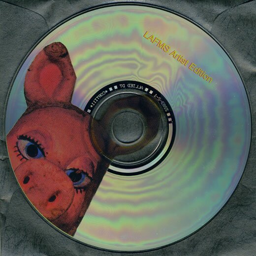
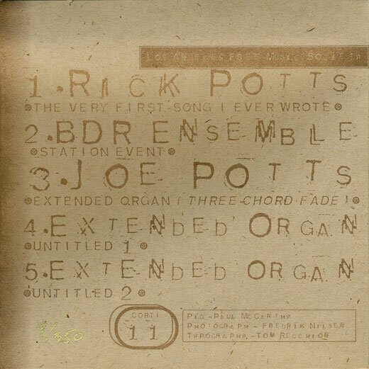
Posted by ben on 04 Apr 2008 | Tagged as: design, image & sound, music, performance art
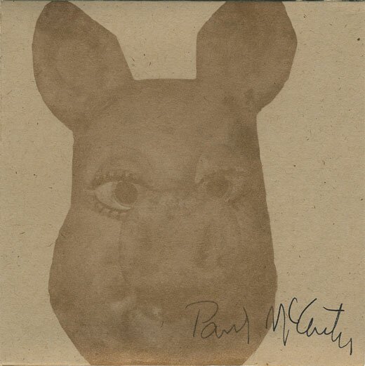
In another attempt to explore the intersection of music and visual art (see also), I give you a rare Los Angeles Free Music Society CD, on which Paul McCarthy plays alongside fellow artists John Duncan and Tom Recchion, photographer Fredrik Nilsen, and noise pioneer Joe Potts (of Airways). Included with an edition of The Lowest Form of Music box set, this CD includes a 30-minute organ drone by Potts, a recording of a radio “event” by the BDR Ensemble (Michael Delle Donne-Bhennet, John Duncan, and Tom Recchion), and some indescribable weirdness from Extended Organ (Joe Potts, Fredrik Nilsen, Paul McCarthy, and Tom Recchion). I’m including a few notes on the recordings below.
“3 CHANNEL CHORDS” was produced in an attempt to create an undulating mass of sound which seemed at first to be static drone while actually being a complex constantly mutating entity. The music was recorded in these separate takes on three tracks. Each track has sixteen channels of “CHOPPED OPTIGAN” run through a stereo mixer with the slide pots arranged to form a sine-wave pattern. Overt the course of thirty-plus minutes the sliders are constantly adjusted so that the sine pattern ripples across the mixer and then returns to the starting position. This formula is repeated on three separate channels, and then mixed down to stereo. I performed it and Rick Potts engineered it in his studio/living room. This recording marks the debut of the CHOPPED OPTIGAN.
— Joe Potts
BDR Ensemble: Michael Delle Donne-Bhennet / John Duncan / Tom Recchion * KPFK 90.7 FM-Los Angeles * Sponsored by Close Radio * December 1, 1977 * Duration 80 Minutes
Station Event was intended to use as a medium of communication rather than one of broadcast. It was performed live over Close Radio from two separate rooms: Delle Donne Bhennet (woodwinds and percussion), Recchion (invented instruments, piano and available materials) performed in KPFK’s Studio A. Paul McCarthy joined them toward the end of the work. From the control room, Duncan asked for and monitored phoned-in responses to what the ensemble was doing. Telephone calls and music from Studio A were mixed at the discretion of Steve Tyler, night engineer at KPFK. The two rooms were sound-separated, Tyler alone was able to hear the complete broadcast at its source.
— Tom Recchion
Posted by ben on 31 Mar 2008 | Tagged as: design, net.art, photography, poetry, politics

is a new blog by an old friend and occasional collaborator, publishing research he has conducted over the past year or so. You may find that it bears a certain affinity to Emvergeoning’s comment section, being a poetic collage of anachronistic media. Enjoy.
Posted by ben on 18 Mar 2008 | Tagged as: design, photography, silliness
Check in with Photoshop Disasters, a new blog documenting the travesties arising from careless use of the clone tool and other weapons in the photo “retouching” arsenal. Naturally, they mostly involve adding, removing, and distorting women’s body parts, as well as a few unruly hands. [hat tip]
Posted by ben on 12 Feb 2008 | Tagged as: design
Ever since I got a subscription to the now-defunct Emigre magazine, I’ve been interested in how obsessed a lot graphic designers are with ethics. On one level it makes sense, with graphic design being, along with architecture, one of the art few forms that ordinary people have to deal with on a daily basis. On another level it always seemed strange, since ethical considerations don’t seem to factor into the calculations of most of the designers’ clients. But perhaps this is why many designers feel compelled to grapple with morality: there’s a lot of pressure from their clients not to think about it. At any rate, there’s a new article at Design Observer does a good job of exploring the ethical implications of the Enron logo, one of the last logos created by uber-designer Paul Rand. The point that branding empowers consumers (as made in this Economist article) is an important one that is too often overlooked.
PS What is up with this new Hyatt Place logo? Does anyone find this compelling?

PPS Check out Brand New, a blog on corporate identity for more discussion of logos and branding.
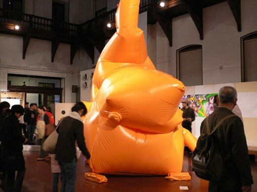
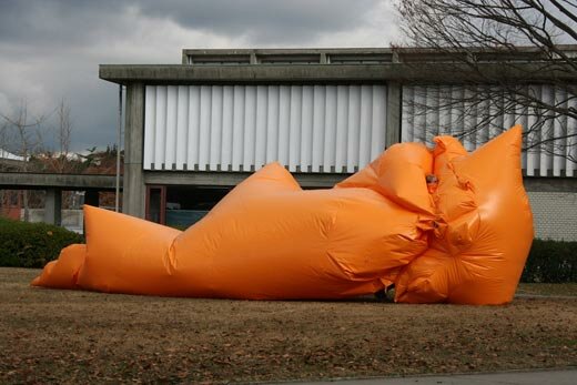
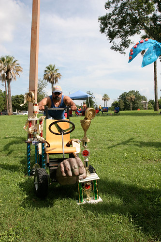
Posted by ben on 11 Jan 2008 | Tagged as: art + bikes, design, in yo face, performance art, silliness
As many of you know, San Antonio sculptor / performer Jimmy Kuehnle has been in Japan since August working on a Fulbright project. He recently posted photos of his first two exhibits, at the Kyoto Museum (Artjam 2007) and the Aichi Geidai Gallery in the Aichi Prefectural University of Fine Arts and Music. Continuing a body of work he started in San Antonio, Kuehnle fabricated huge, inflatable sculptures, which also served as interactive / performance pieces.
Mr. Bubble Head, which Kuehnle made for Artjam, is a huge orange inflatable sculpture with ropes criss-crossing inside. Kuehnle spend much of the opening inside the sculpture tugging on the ropes as people walked by, creating an impression of organic response to the viewers’ presence. Museum visitors were also allowed inside the sculpture at various points, turning it into an interactive sculpture.

His piece at the Aichi Geidai Gallery, called Big Blob, was another inflatable sculpture made of the same orange material. This piece, however, was a suit which Kuehnle could walk around in “like a large leviathan.” After his performance in this enormous suit, Kuehnle invited audience members to try it on — but it seems a bit more unwieldy than those ridiculous sumo suits.

Posted by ben on 09 Jan 2008 | Tagged as: design, politics

A few days ago, Speak Up posted an interesting analysis of Obama’s campaign logo and its many, many variations. He’s definitely not skimping in the graphic design department. Today they take a stab at his brand message — the “change” mantra. A lot of people justifiably complain that he is short on substance (read: concrete policy proposals), but he sure has the image put together.
UPDATE: Fixed the first link (it originally went to the same place as the second link).
Posted by ben on 08 Jan 2008 | Tagged as: design, essays, graffiti, responses/reviews, wordy
There’s a study making the rounds which investigates the connection between cultural consumption and social position. The findings are being trumpeted as “There’s no such thing as a cultural elite” — but this is a bit misleading. What the study finds is that first, cultural proclivities are determined by social status rather than social class (i.e. it’s more about your education and occupation than your tax bracket). Second, people tend to either seek out popular culture, or to seek out both popular and “high-brow” culture. The interesting point here is that there is no statistically significant group that pursues high-brow culture while shunning low-brow culture. So, for the most part, people are either passive consumers of culture (or “univores”), soaking up the popular types of music, theater, and art that surround them, or they are active consumers (or “omnivores”), spending time and energy pursuing the more rarefied art forms, while also enjoying the arts of the common man.
However, as the study notes, this “univore-omnivore” distinction gets a bit murky when it comes to the visual arts (there’s also another paper by the same authors that focuses specifically on the visual arts). If you clicked on the link at the beginning of this post, you probably noticed that the article in the Toronto Star suggests that the study finds that “the visual arts do not figure very high on anyone’s to-do list.” This is where things get complicated, and naturally, where the journalist gets lazy. The survey the study is based on asked about 6,000 people in Britain what kind of cultural events they attend, including things like rock concerts, jazz concerts, operas, movies, gallery openings, etc. In the visual arts, all five categories boil down to the question: how many museums, galleries, or art / craft fairs have you attended in the last 12 months? Those types of events that could be classified as popular (craft fairs and cultural festivals) actually received much lower attendance than those classified as high-brow (museums and galleries), and thus the “univore” group doesn’t really apply in this area.
The authors of the study also admit that they don’t have any data on home or street consumption of visual art (paintings, posters, graffiti, advertisements, or coffee table books). In a footnote they point to showing that in the working class home, most visual objects are either mementos or decorative objects, both of which are taken as “not artistic.” I think at this point we can begin to see the problem with these findings. Popular forms of visual art are practically defined out of existence, as cinema is grouped with theatrical arts, and all the graphic design, architecture, and other “decorative” elements that constantly surround us are taken to be something other than art. There are numerous ways to engage in visual culture besides going to galleries, museums, and craft fairs, none of which are captured by the dataset used for this study.
Posted by ben on 04 Dec 2007 | Tagged as: design
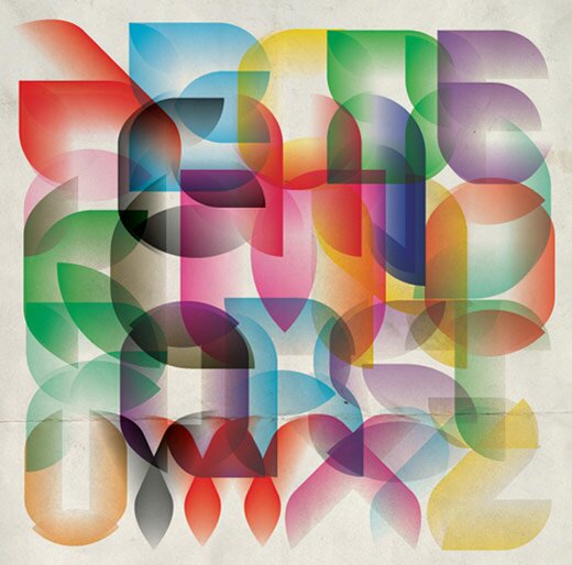
Armin at Speak Up gives us the 2007 typographic design trends round up (via Design Observer). Apparently legibility is out, along with counters (I blame the street artists). Image shown here is from a poster by Andrei Robu.
Posted by ben on 03 Dec 2007 | Tagged as: books, design, essays, responses/reviews
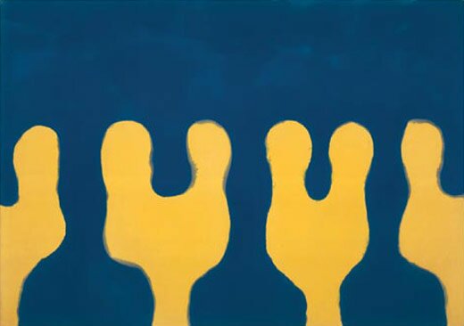
I just got an email asking why we hadn’t covered the Paul Feeley show currently on exhibit at Lawrence Markey, and my excuse was that I’m not good at writing about that kind of art. However, it’s an impressive show, and deserves more attention. So I decided to quote from a catalog / book of Feeley’s work put out by Matthew Marks and Lawrence Markey back in 2002. This passage is from a short essay about Feeley written by Lane Relyea. is definitely worth picking up if you are interested in Feeley’s work. I’ll also take this opportunity to scold our San Antonio readers for not attending Lawrence Markey’s openings with more consistency (you know who you are) — he consistently puts together great shows by important artists.
Feeley’s paintings from the ’60s betray too much of High Modernism’s earnest optimism to be characterized as primarily subversive, and yet it’s also hard to see them as bent on autonomy. With their extendable patterns of simple, interlocking forms and their nondeclarative quality gained by the back-and-forth play of assertive and recessive shapes, they’re too suggestive of tiles, fabrics, and other such prosaic materials. These references might in turn place Feeley’s art within [Constructivism], except that there’s no mistaking Feeley for a harbinger of revolution. Feeley’s mature work seems to bear the influence of postwar industrial and commercial design and the intense interest paid to it by college art curricula, lifestyle magazines, and museum curating (including the series of “Good Design” shows MoMA mounted in the early ’50s). In Feeley, as in all these instances, the attempt to merge art and life was made without any nervous glancing at the clock of revolutionary history. Historical time-keeping was also a prominent feature of Modernist painting as Clement Greenberg conceived it, which may help to explain why the critic’s support for Feeley was only lukewarm. Paintings were less likely to participate in grand historical advances if they nestled too comfortably in the private spaces of home and daily social life, where history loses sight of its main actors and staging grounds, its leaders and elections and wars, and instead moves almost imperceptibly.
Posted by ben on 13 Sep 2007 | Tagged as: design, responses/reviews
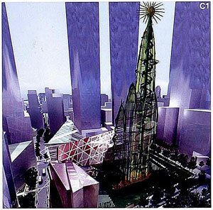 Over at Tyler Green’s house, a long series of posts about art responding to 9/11 is underway. So I thought I’d make a little contribution by way of discussing pre-9/11 work that may provide a vision for a post-9/11 world. In 1908 architect Antoni Gaudi began working on a project called Hotel Attraction for the site which later became the World Trade Center. The hotel, conceived while Gaudi was working on La Pedrera, was abandoned before construction began. The project was unknown to the public until 1956, when one of Gaudi’s assistants produced a set of plans for the 360 meter tall building. There is also another strange connection between Gaudi and Ground Zero. Gaudi was arrested on September 11, 1924 (77 years before the attacks on the World Trade Center) by the totalitarian Spanish government for celebrating the National Day of Catalonia.
Now some, including Gaudi followers and visionary artist Paul Laffoley, have proposed that the hotel finally be constructed on Ground Zero. The concept has some interesting implications — in Laffoley’s words, bringing back “architectural ghosts” to create “utopic space“: “It is not Time that heals, it is the Spirit of History.” Rather than dwelling on the traumatic moment, perhaps we ought to reach back and negate that moment with an unrealized possibility from the past.
Posted by ben on 29 Aug 2007 | Tagged as: design, essays
Emigre just published the history of the Matrix typeface on their site to hail the release of Matrix II. It’s a story of emerging technologies and their impact on design (exemplifying this quote, also from Emigre), of an iconoclastic designer whose work became iconic, and of the kind of debate that has been raging in the design community for years. It’s also the story of a great font.
Posted by ben on 20 Aug 2007 | Tagged as: design, essays, vs.
“It should be clear that in the applied arts, innovation is not an unceasing hunt for heterodox and unseen things from desert islands; it is not merely an image surgery soliciting the senses, or a tension tickling the nerves. The idea of seeking the new for the sake of being different is nonsensical, resulting from the prevailing contemporary ‘market and goods’ ideology. True innovation is one that is rightly able to link the adaptive history embodied in any artifact with the changes of production tools, whenever they occur.” — Sergio Polano, Emigre 26
“But these forward gropings, this anticipation of an undefined future and the cult of the new mean in fact the exaltation of the present. The new time consciousness, which enters philosophy in the writings of Bergson, does more than express the experience of mobility in society, of acceleration in history, of discontinuity in everyday life. The new value placed on the transitory, the elusive and the ephemeral, the very celebration of dynamism, discloses a longing for an undefiled, immaculate and stable present.” — Jürgen Habermas, “Modernity – An Incomplete Project”
Posted by ben on 03 Aug 2007 | Tagged as: design, essays
Time to pull those summer fonts out of the closet.
Posted by justin on 30 Jul 2007 | Tagged as: adventure day, art + bikes, art paparazzi, arts organizations, design, in yo face, mustaches, opportunities, party photos, performance art, possibilities, responses/reviews, rock!, silliness
Everybody has their own story about who won this year, Please post yours in the comments below.
All of these photos (and bunches more with labels) are located here.

click on the link below for more action!
Posted by ben on 24 Jul 2007 | Tagged as: design, tattoo

I just discovered another incredible niche blog, strange maps. Here you’ll find everything from a map tattoo, to a map of New Jersey constructed using only Bruce Springsteen lyrics, to a speculative historical map of Australia. I’m also grateful to strange maps for turning me onto Cartographismes, a French blog dedicated to reproducing the lovely and intriguing imaginary cartographies of its author.
Posted by ben on 05 Jul 2007 | Tagged as: design, essays, possibilities, responses/reviews
Alice Twemlow, kicking off a piece for Design Observer, points us to a Very Short List post giddily discussing an album which is a soundtrack without a film. Very Short List concludes the post reeling with the possibilities: “Dazzling book jackets without novels inside; awesome stage sets on which actors never set foot; kick-ass magazine covers with no accompanying articles . . . we love the myriad possibilities of this new cart-before-the-horse genre.”
Of course, something like this has been done many times before: Brian Eno’s “” (a 1978 album featuring soundtracks for imaginary films); Stanislaw Lem’s “” (reviews of imaginary books) and “” (introductions to imaginary books); and yes, even Harland Miller’s covers for imaginary books. The Design Observer article focuses on poster art, and the relationship between the poster and the (sometimes fictitious) event or product being promoted. It moves from minimal Japanese poster artist Ten do Ten whose designs only use huge black and red pixels, to Richard Niessen’s “Kong” poster: “A mosaic built up from pixellated K’s, O’s, N’s and G’s and fusing the game-scapes of Donkey Kong and Pong to create an architectural setting for King Kong.” Definitely worth a read.
Posted by ben on 09 Jun 2007 | Tagged as: design, net.art

Susan Kare’s design work may look dated in this age of endless gradients, transparent drop shadows and candy-coated buttons, but she had an immeasurable impact on early computer-based graphic design. As the designer of many of the key icons and fonts on the early Macintosh operating system, as well as icons and other visual elements for Windows 3.0 and OS/2 Warp, pretty much anyone working on a graphical operating system in the eighties was looking at her designs day in and day out. Kare’s font Chicago was used as the default font for menus and dialogue boxes on the Mac OS up through System 7, and then was later revived for the early (pre-Photo) versions of the iPod. She even designed Clarus the Dogcow.
Posted by ben on 07 Jun 2007 | Tagged as: art paparazzi, design, silliness
Daniel Finkelstein discovers the real meaning behind the new Olympics logo…
Posted by michelle on 06 Jun 2007 | Tagged as: design, responses/reviews
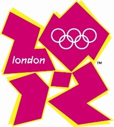
Looks like we’re in for another Ugly Olympics over this seizure inducing, 1980s regurgitative graphic design defect. Yuck. I think the running joke tends to halo around the price tag for this “design”, deflating the British economy of some 45 million euros or something comparable. Eegads, makes the Valero logo look like pan dulce in comparison. Who are they hiring to create these hideous emblems? Post-ictal, color blind, Euclidean embracing pangolins? Perhaps.